Among all contributions to human knowledge, Darwin’s rank among the top. Darwin gave us the concepts of natural selection and descent with modification, which have revolutionized our understanding of the biological world and humans place within it. These contributions have been recognized annually on Darwin’s birthday. But I want to recognize a lesser-celebrated contribution: Darwin’s sketch of the interrelations among species—a “tree of life”—appearing in a notebook now known as “Transmutation Notebook B.”

Darwin sketched this tree in 1837, over two decades before he published On The Origin of Species. He was recently returned from his trip to the Galapagos, and he was working through ideas sparked by that trip. The notebooks he kept are known as the Transmutation Notebooks because in them he contemplated, for the first time, how species might “transmute” from ancestral forms to modern forms. The tree captures the spirit of his forthcoming theory: new species emerge as older species diversify and then pare down. Species “transmute” only insofar that thousands of those transmutations go extinct, leaving behind just a few surviving lineages.Darwin annotated his sketch with the conjecture “one generation then should be as many living as now. To do this & to have many species in same genus (as is) requires extinction.” Darwin underlined “requires” to emphasize the necessity of extinction to speciation. Species do not just metamorphosize from lesser-adapted forms to better-adapted forms. They fractionate, splitting into a diversity of forms, and that diversity is then selectively winnowed. Every modern species represents a small fraction of the innumerable life forms that once existed—life forms whose fate was extinction rather than propagation.Darwin’s sketch is likely familiar to you. It has appeared on posters and book covers and has been made into necklaces and tee shirts. Some people have even tattooed the sketch to their bodies. But, for all it familiarity, Darwin’s sketch is not the prototypical icon of evolution. That icon is the “parade of primates,” arrayed in linear order from monkey to ape to Neanderthal to human. It depicts evolution as literal transmutation: the monkey transmutes into an ape, the ape transmutes into Neanderthal, and the Neanderthal transmutes into a human.Evolution does not, of course, work that way. Monkeys, apes, and humans are related through common ancestry, not direct descent. Several biologists have made that point—Stephen Jay Gould most prominently—and I will not rehash their argument here. Rather, I want to contrast Darwin’s tree of life with a different icon of evolution: the cladogram.Cladograms are visual representations of common ancestry, first developed by biologists in the 1960s for representing the history of divergence among a collection of species. Cladograms can be constructed from highly precise information—molecular analyses of the genetic overlap between species—so they have become the bread-and-butter of modern evolutionary science. Biology journals are filled with them.In recent years, science educators have glommed onto the cladogram as a means of illustrating common ancestry for the general public. Cladograms have thus spread beyond the scientific domain into the public domain, becoming a stock representation of evolution in science textbooks and science museums. By some estimates, the number of cladograms appearing in public spaces has quadrupled over the past twenty years. Here’s a sample cladogram, one that depicts the evolutionary relations among the four great apes (adapted from one made by T. Ryan Gregory at the University of Guelph):
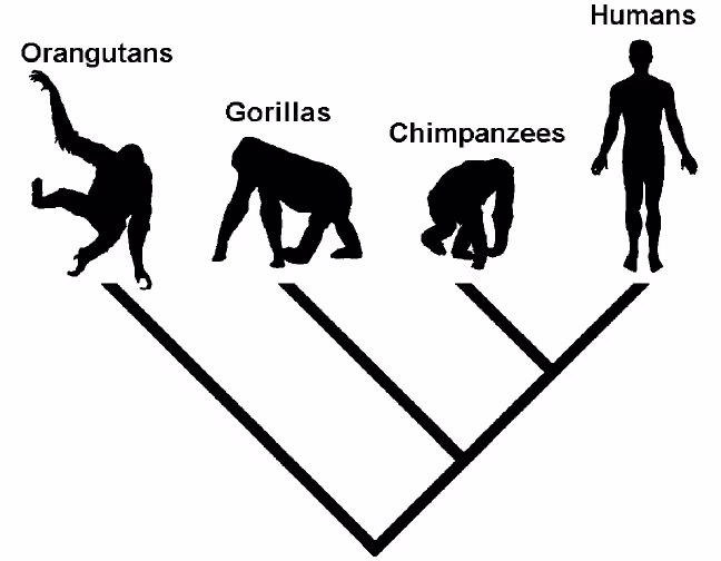
Cladograms depict common ancestry by means of their branches. Given a predefined group of species, the pair that share a common ancestor more recently than any other pair is connected with lines that converge at a node. The node represents their common ancestor. This pair is then connected to every other species via the same logic: species that share more recent ancestors are connected prior to those that share more distant ancestors until all species in the group are interconnected. Each new connection yields a new node, with deeper nodes signifying ancestors that are both more distant (time-wise) and more common (descent-wise).The cladogram above, for instance, indicates that humans and chimpanzees share a more recent ancestor than do any other pair of apes. Humans and chimpanzees, in turn, share a more recent ancestor with gorillas than with orangutans. Orangutans are the most distantly related member of the group; they share a common ancestor with the other members furthest in the past.Cladograms may be a precise way to represent information about common ancestry—information now in ample supply with new gene-sequencing technologies—but they are confusing to non-biologists. Several studies have looked into how non-biologists read cladograms, and all have found evidence of pervasive misinterpretations.For instance, the ordering of species along a cladogram’s tips is largely arbitrary, but most non-biologists interpret the ordering as meaningful. While species that share a most recent common ancestor must be adjacent, their ordering relative to one another can be changed. In the above cladogram, for example, humans must be adjacent to chimpanzees, but they can appear either to the left of chimpanzees or to the right. And gorillas must be adjacent to the human/chimpanzee branch, but they can appear either to the left of that branch or to the right. Most non-biologists, however, assume that a cladogram’s tips are ordered by development or by complexity, with the more ancient (or more primitive) species placed on the left and the more modern (or more complex) species placed on the right.A related misconception is that the further apart two species are ordered along the cladogram’s tips, the more distantly they are related. Orangutans, for instance, appear closer to chimpanzees than to humans in the above cladogram, but that’s just a coincidence of how humans and chimpanzees were ordered. Orangutans have evolved independently from chimpanzees for as long as they have evolved independently from humans and are thus no more closely related to chimpanzees than to humans. All three apes share the same common ancestor, regardless of the fact that humans and chimpanzees share a more immediate ancestor as well.Perhaps most problematic, cladograms present a skewed picture of evolutionary change itself. The blind and messy process of diversification-plus-winnowing is represented as a series of straight and orderly lines. The historical record is wiped clean of all false starts, leaving only the “successful” lineages present today. As many as 99.9% of the species that once existed are now extinct, meaning that, for every tip in a cladogram, there are 999 tips not represented.Darwin’s tree of life bypasses all these interpretive problems. Its tips are not arrayed in a line, so there is no way to infer meaning from their order. Its tips are not spaced in standard intervals, so there is no way to infer meaning from their distance. And its tips include species that no longer exist, so there is no reason to assume that modern species were the sole descendants of earlier species. Every modern species is accompanied by several of its extinct cousins—not all 999 extinct cousins but at least some.To be fair, cladograms were not created as icons of evolution for the general public. They were created as tools for representing hypothesized relations among biological taxa—tools created by biologists for biologists. Cladograms do an excellent job of sorting deep, genetic similarities from superficial, perceptual similarities—showing us, for instance, that manatees are more closely related to elephants than to dolphins or that dolphins are more closely related to cows than to manatees—but they do a poor job of conveying the blind and messy process that gave rise to those similarities.Darwin’s tree of life, on the other hand, represents evolutionary change in a way that is consistent with the nature of the change itself: non-directed, non-hierarchical, multi-dimensional, and multi-causal. Indeed, the purpose of this representation was not to highlight the relations among living species but to highlight the relation between living species and extinct species—to show how living species are the lone survivors of a family of otherwise extinct species. Darwin’s tree may not suitable, as an informatics tool, for advancing modern evolutionary science, but it is a wonderful way of conveying that science to the general public, succinctly illustrating both the selective nature of evolutionary change and the historical context of shared ancestry.So this Darwin Day, consider investing in a tree-of-life tee-shirt or a tree-of-life necklace or even a tree-of-life tattoo. You’ll be honoring Darwin’s legacy while also conveying a cognitively apt representation of evolution to the public at large.